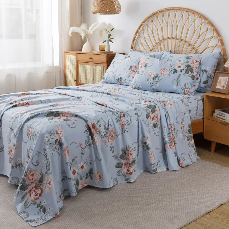


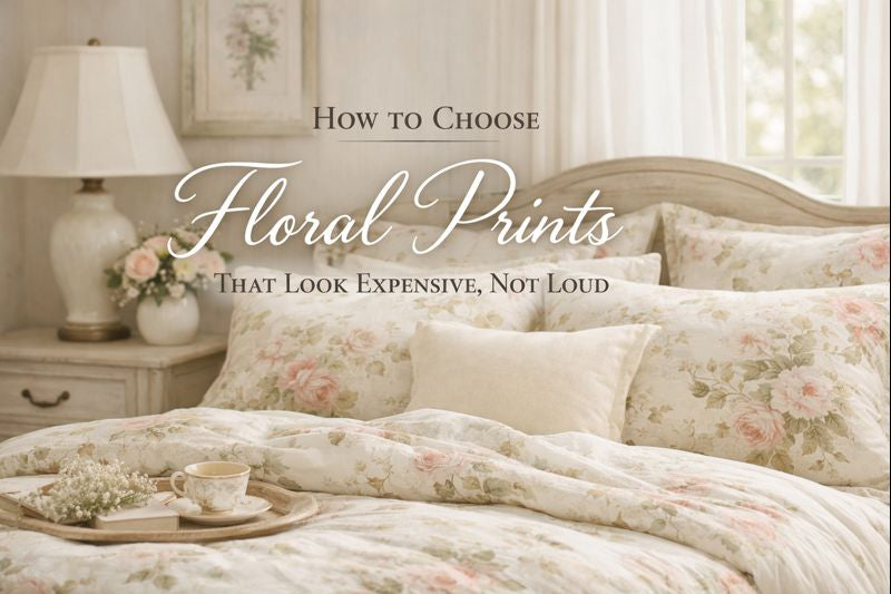
Floral prints have always had a place in the home—but not all florals feel the same. Some evoke quiet elegance and timeless comfort, while others overwhelm a space the moment you walk in. The difference isn’t about trend or price point. It’s about restraint, balance, and intention.
If you love florals but want your bedroom to feel elevated rather than busy, here’s how to choose floral prints that look refined, thoughtful, and quietly luxurious.
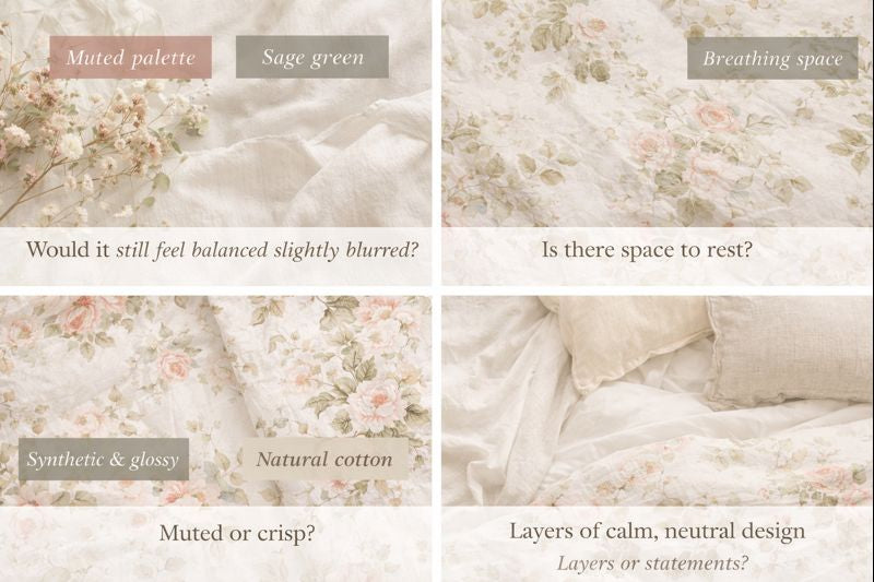
1. Start With Color Restraint, Not Pattern Size
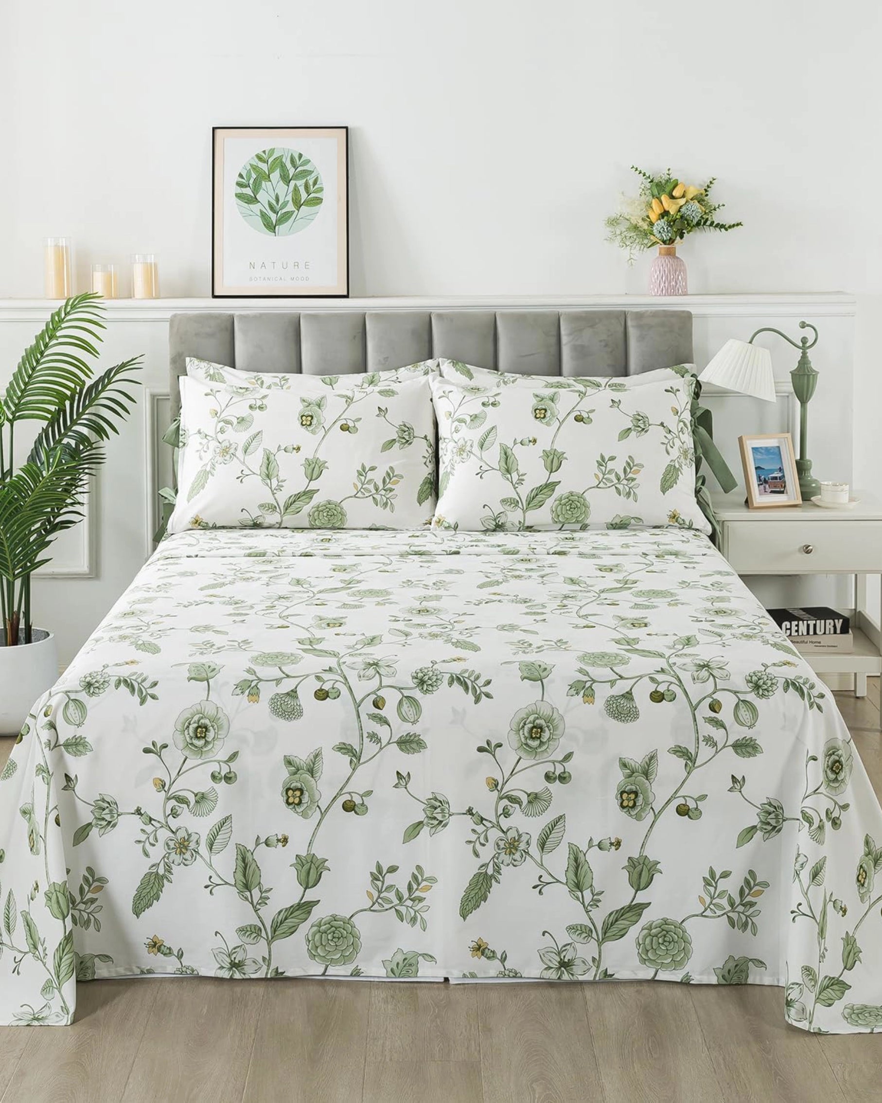
One of the most common misconceptions about floral design is that “small equals subtle” and “large equals loud.” In reality, color does far more work than scale.
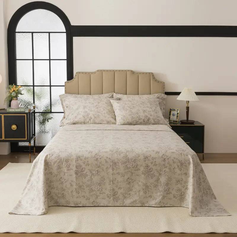
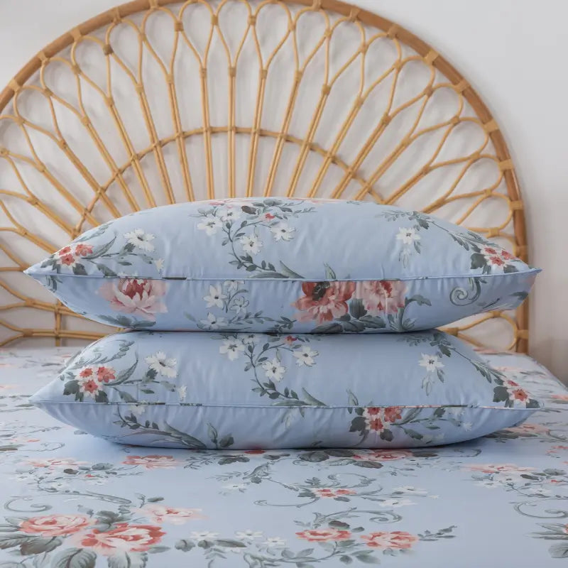
Expensive-looking florals tend to live in controlled palettes:
-
Muted neutrals
-
Dusty pastels
-
Soft blues, sage greens, warm creams, or faded rose tones
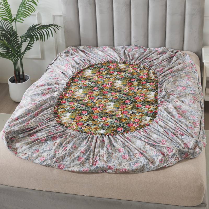
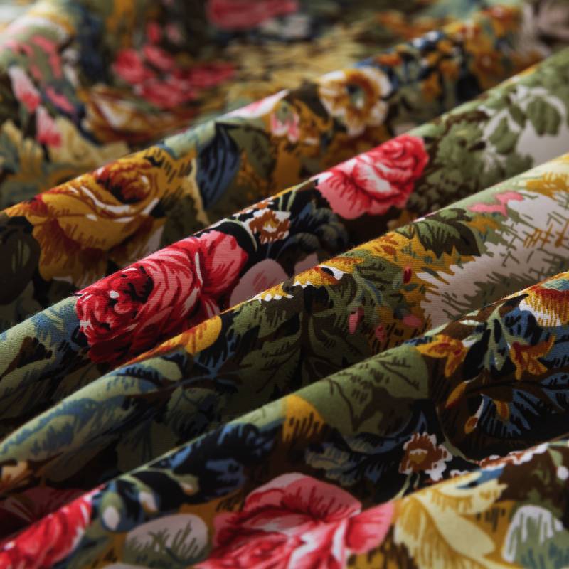
When a floral print limits itself to two or three harmonious colors, even a larger motif can feel calm and intentional. Loudness usually comes from high contrast—sharp blacks, overly saturated reds, or too many competing hues.
Before choosing a floral print, step back and ask: Would this still feel balanced if the pattern were slightly blurred? If the answer is yes, you’re on the right track.
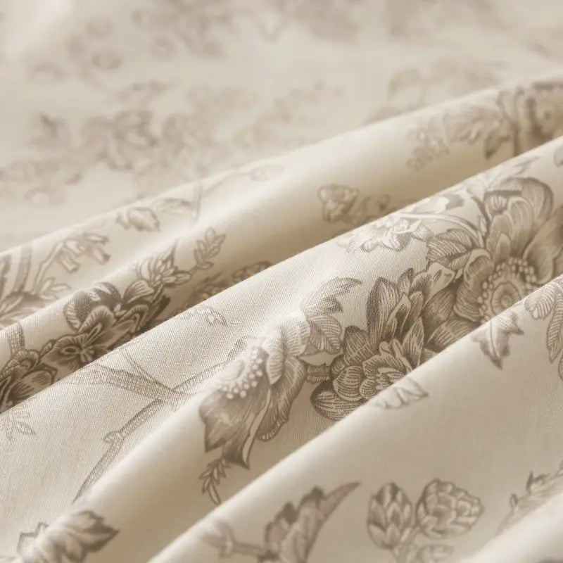
2. Look for Breathing Space in the Design
Luxury is rarely dense. The same principle applies to floral patterns.
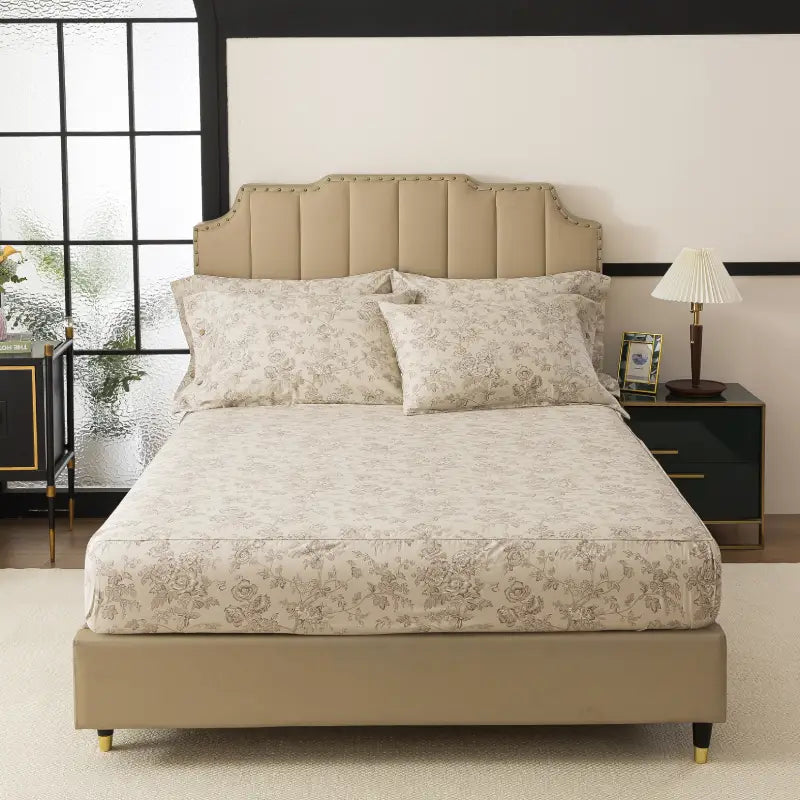
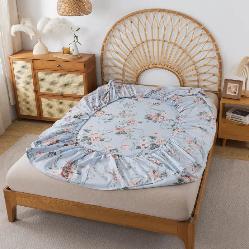
High-quality floral prints allow space between motifs. The background isn’t an afterthought—it’s an active part of the design. Whether it’s a soft ivory, a washed linen tone, or a pale gray, negative space gives the eye room to rest.
Crowded florals, even when beautifully drawn, tend to feel visually noisy. More breathing room creates a sense of ease—and ease is what makes a space feel expensive.
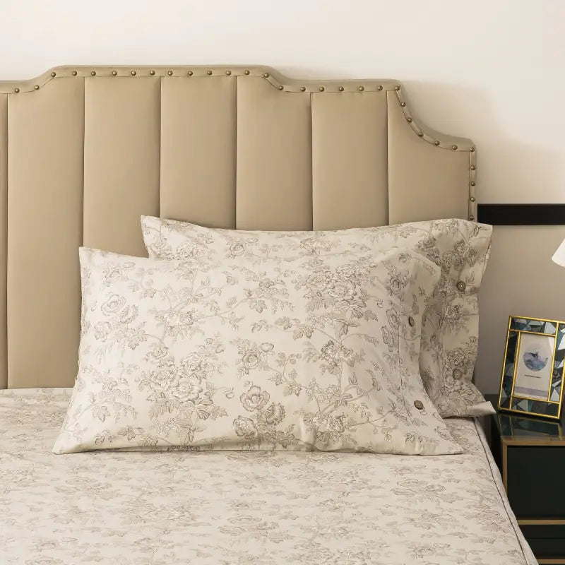
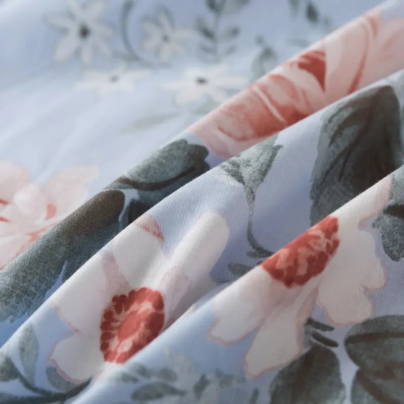
3. Choose Soft Edges Over Sharp Lines
Another subtle marker of refined florals is how the pattern is rendered.
Expensive-looking florals often feature:
-
Slightly blurred outlines
-
Watercolor-like transitions
-
Gentle shading instead of harsh lines
Sharp, high-definition edges can make a floral feel graphic or decorative rather than livable. Softer edges feel more natural—like something that belongs in daily life, not just on display.
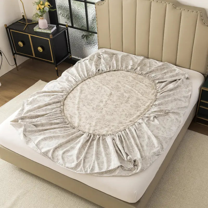
This softness also translates better to fabric, especially cotton bedding, where comfort and touch matter as much as appearance.
4. Let Fabric Quality Do Half the Work
A floral print never exists on its own—it lives on fabric. And fabric quality changes how a pattern is perceived.
On breathable, natural cotton, floral prints appear:
-
More matte
-
Less reflective
-
Visually calmer
Synthetic or overly glossy fabrics can amplify color and contrast, making even tasteful florals feel louder than intended. Natural fibers absorb dye differently, creating depth instead of shine.
If a floral looks slightly muted rather than crisp, that’s often a sign it will age better—and feel more refined over time.
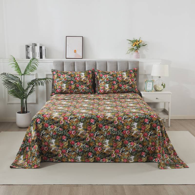
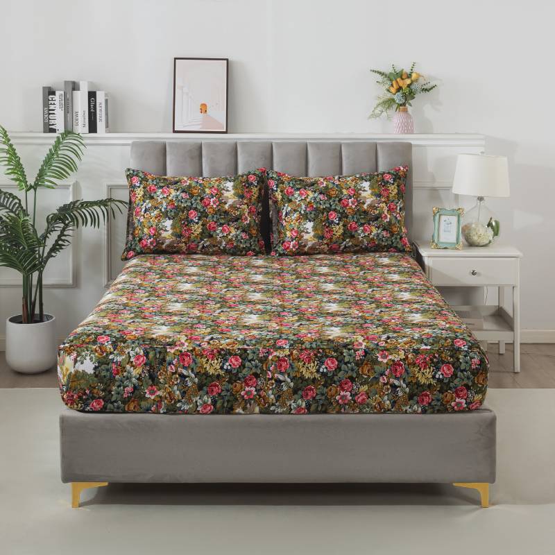
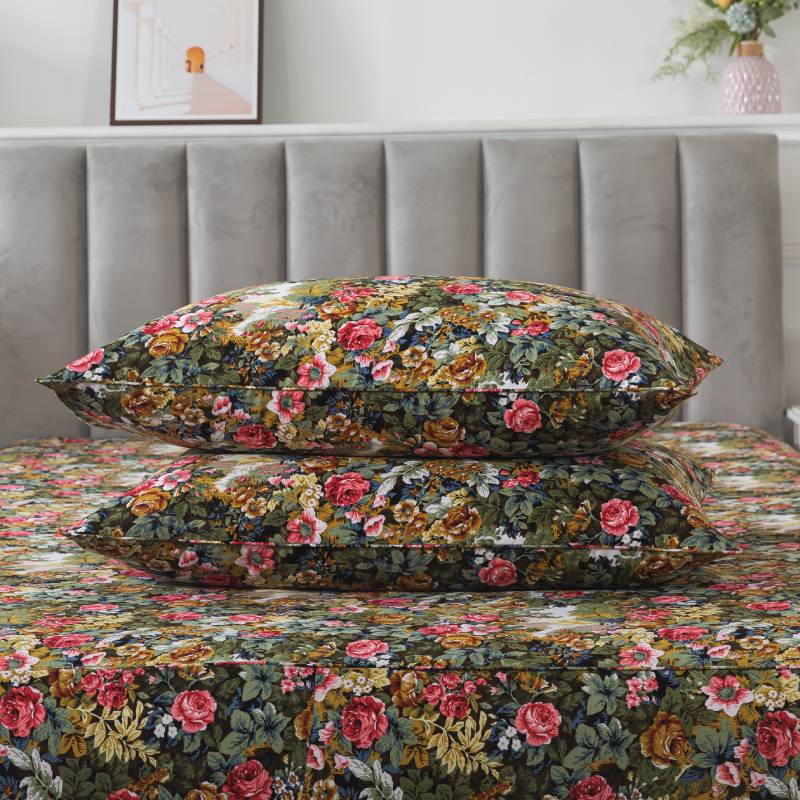
5. Think in Layers, Not Statements
Luxury interiors rarely rely on a single bold statement. Instead, they’re built through layers that quietly support one another.
When using floral bedding, let it be part of a conversation:
-
Pair florals with solid-color sheets
-
Balance them with neutral pillows
-
Keep surrounding textures simple
This approach allows the floral to feel intentional rather than dominant. The goal isn’t to showcase the pattern—it’s to let it belong.
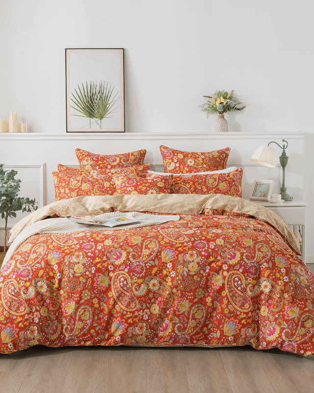
6. Avoid Trends That Announce Themselves
Some florals feel “loud” not because of color or scale, but because they’re tied too closely to a specific trend.
Overly stylized, hyper-decorative florals can quickly feel dated. Timeless florals, on the other hand, borrow from nature without exaggeration. They don’t ask for attention—they earn it quietly.
When in doubt, choose florals that feel familiar rather than fashionable. Familiarity, when done well, often reads as confidence.
7. Ask the Right Final Question
Before committing to a floral print, ask yourself one simple question:
Can I imagine living with this every day—not just admiring it?
If the answer feels calm, reassuring, and yes, then the floral likely has the restraint and balance that define understated elegance.
Because true luxury in the bedroom isn’t about being seen—it’s about how a space makes you feel, night after night.